Rethinking UI building in Appsmith, part I
UI building in low-code tools
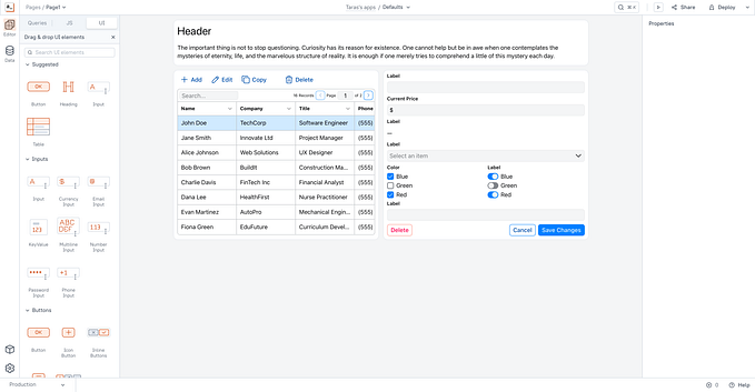
Most existing low-code tools share the same principles of interface design since the days of Visual Basic. There’sa grid, often with different vertical and horizontal scales and widgets aligned to the grid.
This makes UI building really fast as you can create a simple interface for an app in a matter of minutes using natural drag and drop mechanics. The low entry barrier creates a false impression of efficiency, but reality hits you back fast.
During the lifecycle of the app, you’ll have to make tweaks, add and remove widgets.
Unlike generic canvas tools, UI building apps often don’t let you overlap controls, so inserting a new input field to the form or adding a button becomes a non-trivial chain of actions as often there’s no free space for newly added widget.
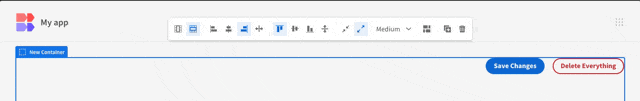
Platform creators tried to address this by adding reflow mechanics which did help in some scenarios while making things even worse in others.
The example below demonstrates obvious flaws of a specific reflow implementation, yet the root cause is much deeper.
A combination of a low density grid canvas and a “no overlap” rule implies that to place a widget you must have enough room for it so that a trivial add → resize → move action chain turns into try adding a widget → find out there is not enough screen estate to place one → clean up the layout to fit the widget→ add a widget → tidy up the resulting layout by moving and resizing all affected widgets. The widget is placed, but now you have to fix the layout manually.
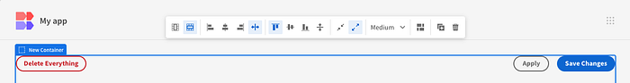
More advanced reflow algorithms deal with basic scenarios like inserting a widget…
…while still requiring unnecessary tinkering for anything more complex.
It is still possible to handle these cases programmatically and significantly improve the UI building experience on a grid-based canvas, but doing so requires designing a broader set of layout algorithms.
Another downside of a background grid is a lack of fluidness. The apps do look ok within a certain range of breakpoints, but you cannot create a universal UI that works reliably across a wide range of mobile and desktop devices.
This is a fundamental constraint being a result of a lack of block wrapping mechanics which are nearly impossible to introduce without a paradigm change.
Autolayouts
But wait, haven’t these problems been addressed by web page builders years ago?
They have. Say, Webflow, Framer or Plasmic are all great examples of efficient visual tools for assembling modern web interfaces.
If you are familiar with the concepts of Flexbox or CSS grid and know how to use them to your advantage, you can build almost anything.
The problem is that in our particular case, most of the users do not understand the basics of interface design and don’t have any relevant knowledge of frontend development.
The very first tests confirmed this: our app builders couldn’t easily adopt the mental model of Flexbox and didn’t understand why they must nest multiple containers or align widgets using the parent’s properties.
Grid-based canvas is beautiful in its intuitiveness: you may start using the product without any tutorials.
Autolayouts, on the other hand, are harder to understand, but they are way more scalable and efficient in the long run.
Having the benefits of both approaches was too tempting.
Executing intent
Let’s take a look at an autolayout-based UI builder of Budibase.
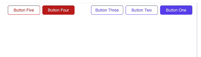
How do you move a button from right to left? You cannot just drag it there, you need to modify the parent container’s properties.

And what if we have three buttons: one on the left and two on the right?
We’ll wrap two buttons in an additional container, configure the container and align it inside the parent container by adjusting the parent container’s properties.
Isn’t it a bit too much for just aligning three buttons? We haven’t even started building the interface, but we already have to think about babysitting containers for the very simple things.
Ok. The user doesn’t know how Flexbox works.
But we do! As long as the user can express what they want, we can do all the configurations ourselves. We need just one thing.
Intent
As long as we are able to read the user’s intent, we can process it and provide the desired outcome.
The concept of intent-driven design is not new. You might have seen it in one of numerous city building games, game engines or HCI demos.
Let’s see if it can help us build a better interface design experience for non-designers.
Intent-based autolayouts, first steps
We started by trying to combine the familiar drag and drop mechanics with the flexbox foundation.
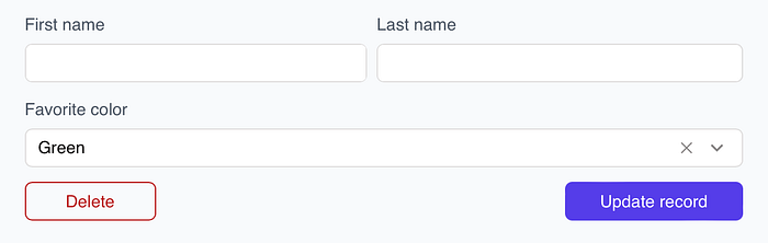
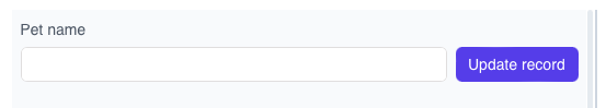
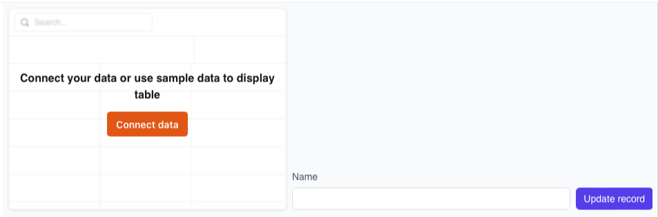
The form below is super simple and can be reproduced in no time using existing grid-based UI building tools.
With Flexbox things are way more complicated: we’ll need to replicate a two-dimensional interface with unidimensional stacks.
We have a vertical stack for the whole form, a horizontal stack for name inputs and another horizontal stack for buttons.
By combining horizontal and vertical stacks and modifying their properties we can replicate any generic app’s interface.
The trick here is that the mental model of a user is different: previously they just moved widgets to reorder, group or align them without having to think of anything more complex or abstract.
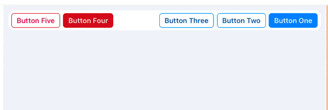
In the following example, the user moves widgets to the desired position and the app automatically manages wrappers to create the expected layout.
This mechanic worked great on simple use cases but revealed some side effects.
Multiple widgets with identical heights do play nicely together, but what if you need to place a button next to an input?
We may agree that we just bottom-align everything inside horizontal stacks and it solves our problems for all existing widgets, right? And what happens if we add a table and start building a form nearby? What if we place some widgets inside containers?

Operating on the level of atomic widgets also provided an inferior experience on wrapping controls on smaller breakpoints as they were simply moved to the bottom one by one.
The direction was correct, but the execution needed refinement.
Project Anvil
Our Autolayout engine, built as an inexpensive successor to the grid-based canvas has started to wear off too fast: the legacy foundation slowed down the progress, widgets needed rewrite and the existing container was clearly a wrong building block for creating quality interfaces.
On the bright side, the intent-based approach demonstrated a significant efficiency boost while building and modifying generic interfaces of various levels of complexity. And, as intent-based mechanics were based on the foundation of existing users’ habits, they were adopted fast.
We pulled the break on Autolayouts and returned to the drawing board with the new initiative codenamed Anvil.
Moving away from atomic widgets towards the higher order entities helped us bring widget responsiveness to a new level: the fewer individual widgets you have on the board, the easier it is to organize them.
The thing is we cannot make everything a high order component as this would require creating and maintaining an enormous amount of inflexible building blocks and the users will easily get lost in these.
So we need containers to group multiple widgets semantically. Yet our users strongly prefer to drag and drop widgets around the canvas and only use containers for visual styling. They don’t need the containers. We do. But hey…
What if instead of making containers optional we make them mandatory and handle the micromanagement automatically?
How should these work?
These containers cannot be just the same visual grouping entity that exists in Retool or UI Bakery. Such containers won’t be responsive. And we should probably limit nesting as nested autolayouts will be abused by non-design-savvy app builders.
If we zoom out and take a look at the apps our users want to build, we’ll see a pattern: the apps have a two-dimensional layout of large blocks and small two-dimensional layouts for smaller widgets inside the blocks.
But we have already designed and tested mechanics for creating two-dimensional interfaces out of basic widgets, why don’t we expand it to a higher level?
Let’s try imagining how it may work.
When we add any widget to the empty space of the canvas, we automatically wrap the widget in a special container and this way avoid the problem of “orphans”: every single widget will get a wrapper.
The containers can be packed into a 2D structure using the same intent-based mechanics we built earlier. These containers are responsive and will wrap in a space-constrained environment.
Looks elegantly simple before we notice one microscopic detail: all containers have equally proportional width.
With CRUD apps being among the most popular use cases for low-code tools, this becomes an elephant in the room: dedicating an equal amount of space to both the table and the record details already sounds like a waste of precious screen estate.

One of the key differentiators of autolayouts is that they usually do not allow manual resizing and therefore its users don’t have to waste time manually adjusting widget widths.
At the same time, we do need to have large blocks of various sizes.
And be able to wrap them predictably.
Instead of reintroducing the concept of resizing to autolayouts, we came up with a less flexible, but more bullet-proof solution we internally called zones and sections.
Let me explain how it works.
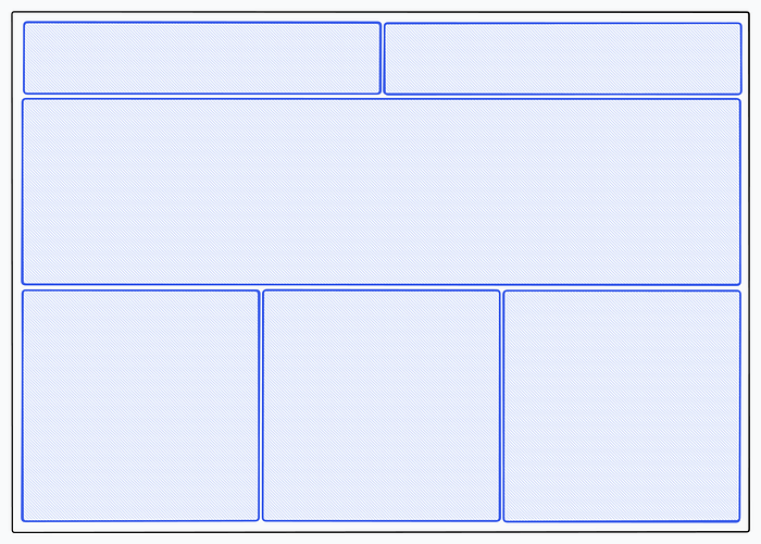
We start with a familiar 12-column system.
Then split the canvas vertically using sections, full-width blocks.
Now we horizontally split each section into up to 4 zones using columns as a guide.
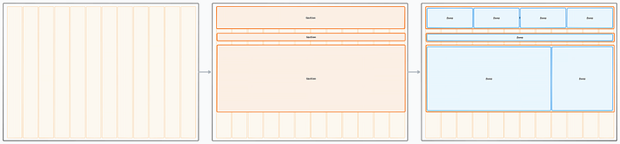
At this point, we have a neat 2D structure with clear semantic separation of containers (zones), so they don’t just wrap randomly, but do it within a dedicated section.
The limitation of 4 zones per section comes from two constraints: 12 column layout (allowing equally sized 2, 3 and 4 zones per section) and a minimally reasonable zone width of 2 columns. That is enough to cover the vast majority of generic app layouts we tested.
A zone can be added explicitly (as a pseudo-widget) or implicitly (by dropping a widget into the empty space of the canvas). Sections are managed in the fully automatic mode.
Interesting, but how does it help us with resizing?
A zone in our concept is a rough equivalent of an autolayout container we researched earlier: widgets inside adapt to different breakpoints and wrap automatically. So we don’t need to worry much about the internals and focus on the app-level layouts.
The most straightforward way of redistributing space between two zones is implicit, by using a property panel.
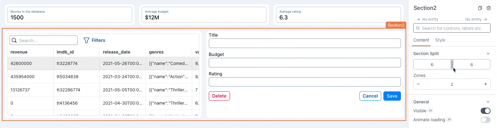
We select a section and set the ratio using a split control similar to what you may find in Webflow, Plasmic or other advanced UI building tools.
This mechanic is extremely reliable, but has a serious downsize: it’s not visual.
Explicit redistribution, on the other hand, is as simple as dragging a slider.

Another downside of explicit space redistribution is a need to provide feedback to the users that the drag handle has reached a certain breakpoint.

Rather than relying solely on overlay indicators, we used a combination of bounce animations and column snapping to inform the user about snap points. While it feels less fluid if you are pointlessly dragging the handle back and forth, it significantly reduces the number of errors while still providing an elegant way of visually redistributing zone ratios.
So, we made it? We designed a system that helps you build and update generic, fluid interfaces in no time, right?
Well, almost…
The end of part I, to be continued…


