iPad Pro for UX Designers: the good, the bad, the ugly and what we can do about it
Greetings. My name is Taras and for the last 13 years I’ve been designing apps.
Some of you may know me as a guy who made DaisyDisk, but today I’d liked to talk about Apple’s latest and greatest touchscreen device, iPad Pro.
I bought mine the day it came out.
A large screen with Multi-Touch, a decent stylus (they call it a Pencil).
Must be the designer’s dream come true in the emerging post-PC world, except…
… it’s not.
As usual, it’s the software that crawls behind.
Many seemingly great apps are barely usable and little marvels like Procreate are most useful to illustrators.
Now let’s go to the very beginning and try to find out what an iPad Pro is.
A large tablet? A super-sized iPhone? A touchscreen laptop sans keyboard? No joking. A lot depends on your answer.
A Laptop, a Phone or a Tablet?
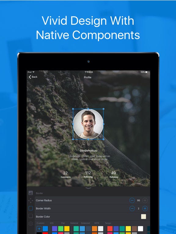
Have a look at the app, Autodesk Graphic, former iDraw.

It’s a really powerful vector editing app with tons of features that runs on a Mac, iPad, even iPhone. You may start drawing an illustration or a scheme on your laptop and then switch to the iPad to continue…
But you won’t.
The tablet version is powerful and mighty with all desktop class features, but after a few minutes of work you’ll find yourself fighting the app’s interface, not designing anything. The main problem with Graphic is that it’s cursed by the old spell of desktop paradigm. All these panels and tiny buttons are familiar, but you’ll literally feel pain while using them.
Rectangle tool, draw, select tool, edit, open panel, edit colour, circle tool… No, thanks, I’m back to mouse and keyboard.
Graphic is not alone here. Other powerful vector editing apps like Bez have very similar issues.
Like it or not, iPad is not a laptop. And it’s unlikely to become one even with a keyboard (ok, a Smart Keyboard) attached. So don’t let the familiar screen size fool you, shrinking down a desktop app will do no good.
Inspr, a mobile prototyping app, is a completely different story.
Its iPad version is merely a scaled up iPhone app that gets very few benefits from a bigger screen.
I never thought I’d say that, but some of the very best iPad apps for designers are made by Adobe.
Instead of trying to push every possible Illustrator feature into the Draw, they’ve made a really polished, iPad-centric app that excels at just one thing, drawing illustrations. You cannot use it for making book layouts, crafting pixel-perfect icons or mocking up the UI of your app, it’s really a single-purpose app.
Or Photoshop Fix that has a wonderful photo retouching UI instead of trying to be an all-in-one behemoth Photoshop. Or Adobe Comp CC that makes it easy to mock-up websites on the go without pretending to become a sized-down InDesign.
But what makes iPad Pro unique? More processing power? More RAM and storage? Bigger screen?
Tool
No. It’s the Pencil that really makes the difference.

For centuries artists preferred to use tools over fingers, so why step back now without even having a choice?
Yes, I know, we’ve had styluses for touch screens forever. Starting with low quality pens with a rubber tip to far more advanced ones that take advantage of Bluetooth connection. But wait, Apple’s Pencil also uses Bluetooth and doesn’t even have an eraser on the other end.
he difference between the Pencil and third party solutions is not obvious as you really have to try both.
Apple Pencil feels just like a heavy pencil while drawing with most alternatives reminds painting with a brush or a using a very thick marker.
These styluses are inaccurate, slow and require you to reconnect each time you switch the app. Not to mention the fact that with most devices you don’t get palm rejection. Does it matter? Sure, because drawing with your palm resting on the iPad is far more convenient than trying to avoid touching the screen.
Ok, the Pencil rocks.
So, what do I get for my $99 except for a need to charge it every few days?
A device that instantly connects to your iPad Pro and allows you to draw like if you are using a real pencil with realistic line strokes and other fancy stuff.
And if I’m not an illustrator?
Then things get worse. Like it or not, for the majority of apps a Pencil is not really different from a finger, except for pressure and angle sensitivity. It may be useful for tapping tiny controls or precise drawing, but that’s all.
Shapr3D is one of the very few apps that takes advantage of the new input method. Take a look at the video:
The guy uses his hands to navigate the virtual world and a Pencil for drawing.
A Pencil is no longer a tiny finger, it’s a separate tool that has its distinct role!
Digital designers have previously used “dumb” tools like a ruler to make straight lines, but the Pencil brings the concept to the whole different level.
Pen, Paper, Scissors
Now let’s try to take a look at Bluprint for UX Design, a wireframing app by Taiki Kawakami.
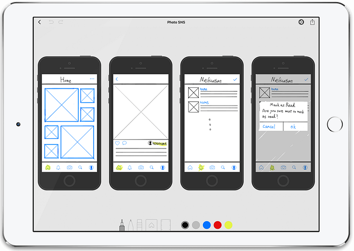
Stencils, pencils and rulers.
We’re living in the 21st century and still try to mimic pen and paper with a thousand-dollar worth device and a hundred-dollar stylus? I mean, come on, that’s a lot of cash for going digital.
With a pack of paper and a small set of tools you may create numerous documents (paper sheets) of many sizes (larger paper or scissors), use many tools with different abilities (pens, pencils, markers, paintbrushes, rulers and protractors), use almost any colour (colour pens, markers or paints and palette). You even have unlimited edits and undos by adding eraser or correction fluid!
For a thousand dollars you may buy a lifetime batch of top quality drawing tools.
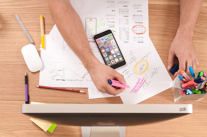
No wonder many designers prefer pen, paper, eraser and a pile of sticky notes for sketching, not their fancy expensive tablets.
Can we change this?
Sure. Just stop looking at your iPad Pro as a large piece of glass and let it be, well, a digital, uber-paper…
Digital Paper
The paper is cheap and we all know how to use it for sketching.
Yet it has one serious flaw, a lack of changeability.
Once your paper mock-up is ready, it’s nearly impossible to adjust it without redrawing. A pencil and a an eraser are your friends, but this means no colours. Coloured sketches may be altered with a correction fluid, but it takes time. StickIt notes, multiple layers of paper or transparent film will help a little, but still don’t really give you the power of an instantly adjustable digital object.
MyScript’s Nebo uses machine learning technology to recognise handwritten text and figures and turns them into fully editable digital instances.
Adobe Comp CC translates handwritten symbols into vector mockups.
It’s hard to beat the paper’s ease of use and software power combined.
Symbol recognition will very likely completely transform the way we interact with our iPads in the nearest future as our digital writings would stop being mere pixels on the screen.
Postscriptum
So, what’s next?
iPad Pro is a great instrument with a lot of potential that needs to be revealed. And if we, designers, need a better tool, we should build it ourselves.
Several months ago I started working on a new app for UX designers, codenamed Blueprint.
Blueprint should reduce the time it takes to create a new mockup and help you build a model of how the app works before you go pixel perfect or start coding.
Do we really need another UX Design tool? It definitely won’t make us smarter or teach us about making great products (or the fact that product design isn’t just about fancy pictures).
But just reducing time it takes to make a sketch or wireframe or changing the way if feels to interact with your iPad is already a lot.
To be continued…

